Thursday, December 27, 2018

Oracle Data Visualization - #Makeover Monday 2018 Week 52 Xmas Spend


Another week, another #MakeoverMonday (MM) set of data to take a look at.


Here is .. The Data: http://www.makeovermonday.co.uk/data/

Year: 2018
Week: 52
Date: Dec 17
Data: data.world
Source Article Visualization:
Average spending on Christmas gifts in the U.S. 1999-2018
Data Source: Statista

Description:
The statistic depicts the results of a survey about the estimated Christmas spending of U.S. consumers from 1999 to 2018. The most recent survey revealed that U.S. consumers expected to spend approximately 794 U.S. dollars on average on Christmas gifts.
Holiday shopping

The Christmas season or so called holiday season is the strongest sales period of the year for retailers. It usually commences on the Thanksgiving weekend with Black Friday being the leading sales and traffic day of the whole season, and continues to the end of January. Black Friday sales are closely followed by Super Saturday, which names the Saturday occurring before Christmas Eve. 

Christmas is a public holiday in the United States and is celebrated on December 25th each year. It’s known as a big economic stimulus for many people to purchase Christmas gifts for their beloved family and friends. After Christmas and New Year’s Eve, retail sales usually peak again in January as many people redeem their received Christmas gift cards and vouchers. The latest holiday consumer survey revealed that almost 48 percent of U.S. consumers plan to buy gift cards or gift certificates in 2016. 


During the holiday season, many retailers extend their return policy and set special shipping deadlines for guaranteed Christmas delivery in order to improve their customer-friendly service.

More Information:
Region: United States
Survey time period: November 1 to 11, 2018*
Number of respondents: 1,037 respondents
Age group:18 years and older
Method of interview: Telephone interview
Supplementary notes: * Figures from 1999 to 2017 were conducted in November of each year among equally large samples.

This is the original chart, a line chart.


As the dataset was published, it looked very simple, and assuming.
And so I thought to myself .. easy .. less than 1 hour and all in the spirit of the #MakeoverMonday!

Let's take a look at my first visualization. A Bar Chart.


Easy. Simple. Created a focus data point that clearly stands out. That's it?


Well, that's it. Well, NOT SO FAST!


Something was telling me that this was too easy and not all was right with this data.

I wasn't sure what, but I was determined to find out.

With that, I turned to my friend GOOG and did a few searches to see what I could find. And what do you know, a dataset showed up, and just the one that I was looking for 😘


Data Source: GALLUP


Good news was that I was able to match data point-by-data-point to the source data in our MM week 52 Christmas shopping in the US.


What I found in this data was different from what was given to us.


  1. There was a second data point for NOV-2002, 2 telephone surveys?
  2. This was a telephone survey about crime?
  3. Where was the data for NOV-2018? Because it is not a part of this data.

This all led me to analyze the data a bit more.

Using 1999 as the baseline I wanted to know how the 20 years since measured up. Not good.
Only 2 years over the last 20 were about the 1999 mark.
A few years we over 15% less and a single year over 25%!

The chart that I created was an Area chart.

This is it.


This was nice, but boring to say the least.


So to give the reader more context I added a few elements.


  • 1999 appeared to be the year that with only small 2 exceptions was far and above the other 18 years. In that, I added a lyric line from the Prince song 1999 and made sure to add that text in his favorite color, Purple
  • Added the survey question asked via telephone to set the frame of mind that gave looking at the data over time as well as added what I thought was a catchy subtitle 
  • Removing all of the data points and only adding back the points that were critical for highlighting the data trend and what was important takeaways over the 20 year span
  • Also adding a few vector images made by Freepik from Flaticon to spruce up the overall design.

This is what I posted as my Visualization. 

What do you think?


Twitter post: https://twitter.com/GADASHEK/status/1078133461221851141

Sunday, December 23, 2018

Oracle Data Visualization - #MakeoverMonday 2018 week 51


It has been a while, the end fo the year was certainly fast paced (heart reference)!


And that gave me another dose of what I wanted to shift my passion for technology wise.


So, that brings me to the next adventure that I am passionate about exploring.
STOP! No, don't worry, I am not leaving the Oracle technology space :)

But in fact, I want to look into the Data Visualization aspect of Oracle tech, and specifically, the product Oracle Data Visualization (DV) {cloud} or Desktop (DVD) {not-cloud} download DVD here.


It was only as recently as this past spring when I knew something wasn't right (or left, that is an eye joke) with my left eye. And for me, the topic area of Visualization has become deeply passionate for me.


And so that led me to start reading books, researching online, listening to podcasts, and just plain talking to people.


One of the books that I read recently was a book called #Makeover Monday by the authors Andy Kriebel (vizwiz.com, Data SchoolMakeover Monday, Tableau Tip Tuesday and Workout Wednesday. He also writes at datavizdoneright.com) and Eva Murray (blog: www.trimydata.com).


Here is "The Book" -> #Makeover Monday http://www.makeovermonday.co.uk/book/


And that brings me to the topic of what I can see as the future of many blog posts to come. Each week as the new data for the week gets published I will participate in #Makeovermonday as it will give me a chance to explore new data, get feedback about the visualizations that I create and work on being able to tell good stories about the data. Lastly, I will focus on using Oracle DV(D) as my primary tool of choice although the #MM community prefers to use Tableau but they do not make that a requirement. You could create your canvas on a napkin, literally and totally your choice.


So, let's get started on the first #Makeovermonday that I am participating.

Here is ..

The Data: http://www.makeovermonday.co.uk/data/

Week: Week 51
Date: Dec 17
Data: data.world
Source Article Visualization:
London Bus Safety Performance (page 3)

Data Source: TFL (January 2015 – June 2018)


About this Dataset
DATA SOURCE: Transport for London

DASHBOARD: London Buses Safety Dashboard – Q2

Objectives
What works and what doesn't work with this chart?
How can you make it better?
Post your alternative on the discussions page.
DATA DICTIONARY
View -- No definitions added for the 1 file and the 11 columns in this dataset.


Now let's get into the data and see if there is a story to tell.


This is the Data Visualization as a sum of the parts and the story that I was able to tell. Enjoy!


--- --- --- --- --- --- --- --- --- --- --- --- --- --- --- --- --- --- --- --- --- --- --- --- --- --- --- --- --- ---
~ letter ~


Dear Abby,
I am writing this letter to inform you about the bus safety,
or lack thereof when riding the London Bus.
This letter is to warn you about the HIGH amount of Bus accidents in London’s
Westminster borough!
You are at a higher chance of being involved in an accident since you are an
Adult Female Passenger. And therefor I believe that it is in your best interest
to select a different mode of transit.

And please, whatever you do, DO NOT RIDE a bus Operated by Metroline!


Sincerely,
A Concerned Data Visualization with a Birds Eye View

--- --- --- --- --- --- --- --- --- --- --- --- --- --- --- --- --- --- --- --- --- --- --- --- --- --- --- --- --- --- 


Oracle Data Visualization Multi-Canvas

Trend
The trend shows that the number of accidents is on a constant rise and with a 95% confidence it will continue that way into the next quarter.


By Borough North, South and 5-parts - Horizontal Bar with Focus on 1 Borough

By Adding more context to the Borough information I wanted to make it easier to identify if there was a Borough that clearly stood out from the rest. And there was, it was in the North.


By London Borough and the 5 Parts - Horizontal Stacked Bar with Borough 5-Parts
I added the Red color to the highest density bar in the entire stacked bar char to make sure to call attention to the clear highest number of accidents in a single Borough in the North and Inner West.


Count of Accidents by Borough - Radar Bar
Specific Borough with clearly the highest number of accidents, Westminster!


Focus on Westminster Groups & Operators - Parallel Coordinates
Again calling attention to the highest concentration of accidents for a particular Group & Operator, that was Metroline!


This was my first week joining the #MakeoverMonday and look forward to next week as well as 2019!


Sunday, November 4, 2018

PBCS - Oracle Financial Reporting Web Studio URLs

PBCS .. Oracle Financial Reporting Web Studio URLs

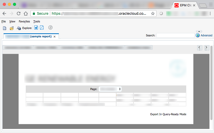
Goal: Easy to use weblink for users to click and run reports (FRs)

While working with PBCS and creating FR (Financial Reports) using the Oracle Financial Reporting Web Studio, I wanted to be able to send a simple URL to Users via email and at the same time use this URL in the Task List.

This would give them the ability to view on their mobile phone, tablet or browser directly without having to log into the app, search-dig around for the report via Reports, etc. They could simply use the URL or the Task List item!

Like this:


So, this is how you would do that, easily, and with a few simple steps.
These steps assume that you have already created and saved your Financial Report (FR)


Let's use the sample app = "Vision" in this case
and the folder "Plan Reports"
with the report named "Income Statement - Act vs Plan"


Step 1: Locate your report in the Web Studio repository folder; Done

example: Vision/Plan Reports/Income Statement - Act vs Plan


Step 2: It is Free to use, go to link https://www.urlencoder.org/

2.1) In the box where it says "Type (or paste) here..."
follow those instructions ;)

2.2) click > ENCODE <

you then have a simply encoded the URL in the proper format

2.3) Copy the entire string result now encoded

In this example: Vision/Plan%20Reports/Income%20Statement%20-%20Act%20vs%20Plan

notice that I needed to also encode the folder "Income Statement" since there is a space in the name


Step 3:
It is fun to know that Workspace is still running, makes me feel like I should be looking for the ships-wheel, Ahoy Matey! .. but I digress ..


The reason that I mention Workspace is because it is needed for this next step.
Your desired outcome should look like this example.
https://<your_services>.oraclecloud.com/workspace/index.jsp?module=tools.relatedcontent&repository_path=/<folder_name>/<encoded_report_name>
Now let's break up the parts


Part 1: <your services>
example: planning-test-MyCompany.pbcs.em2

Part 2: .oraclecloud.com/workspace/index.jsp?module=tools.relatedcontent&repository_path=/

Part 3: <folder_name>/
part 3a: if needed, add folder names
example: Vision/Plan%20Reports/

Part 4: <encoded_report_name>
example: Income%20Statement%20-%20Act%20vs%20Plan

This is an example of the final result:

https://planning-test-MyCompany.pbcs.em2.oraclecloud.com/workspace/index.jsp?module=tools.relatedcontent&repository_path=/Vision/Plan%20Reports/Income%20Statement%20-%20Act%20vs%20Plan

You can now copy paste that URL and use it in the Task List or simply email that URL to any user that has the proper provisioning to run the report!


Monday, August 6, 2018

Available to download - Oracle Data Visualization Custom PLUGIN "Elbow" Dendrogram

Excited to announce that a custom PLUGIN I have been working on is available to download and start using now - available on

The Oracle Analytics Library: https://www.oracle.com/solutions/business-analytics/data-visualization/extensions.html

Within the Extensions tab

or download here


Name: "Elbow" Dendrogram

Authors: G. Adashek & D.Flores

Description:
The “Elbow” Dendrogram creates a hierarchy based Parent-Child like structure with ‘links-arms’ that are bent at a 90° angle. This plugin can render a #measure element and is zoomable.

Friday, June 15, 2018

Smart View 11.1.2.5.800 released!

And so it is mid-June .. and we now have Smart View version 11.1.2.5.800 as stated released in GA!

per the documentation here are the listed new features a part of this release and the hyperlinks to go directly to the documentation for each


Let's take a look at one of the new features ...


Perform a Health Check On Your System (for Smart View settings, Options, etc.)

I really like this feature being added!

So many times as a new user (new Smart View installation), a power user, an administrator, there are a number of settings that are or are not set by default.

Glad that there is now an easy way to be able to see the commonly asked settings all in 1 place to be able to update and/or edit-provide yourself.

This setting is found on the Main Smart View tab within the "? Help" dropdown menu as menu item
named "Health Check"


Click on the menu item and you will see a Health Check diagnosis msg box that shows the Details as information, properties, settings, options are set on your local machine


If you click on the "Recommended Settings" button on the bottom of the msg box the health check will provide another dialog box. In my case, this is a brand new VM .. as my prior VM melted, so none of the Timeout settings have been updated.

This time, no Google searching required or digging up the regedit file .. just 2-button clicks and the settings were updated! I didn't need to know the hex values, etc.

Click "YES"


And with that .. I think this feature might cause 1 of my prior blog posts to become deprecated!!!

Thanks to the Oracle Smart View product management and development teams for implementing the suggestion :)


Side Note:
We heard, were told, and saw slides at KSCOPE18 during the EPM Sunday Symposium session that Smart View and Office 365 support will be coming at some point CY2018 as well as Mac support!!!


Sunday, May 27, 2018

Smart View 11.1.2.5.800 coming soon!

A NEW version of Oracle Smart View for Office will be available in mid-June ..

KSCOPE18 is about that time, would be nice to have the update prior to the conference 😉


Here is the release note:

Oracle Smart View for Office 11.1.2.5.800 will be available by mid-June. This version includes new features such as:
  • Move Formatting behavior enhancement to notify you of performance impact
  • Improved resolution on high-definition devices, such as Microsoft Surface Pro tablets
  • New Health Check, where you can view information about your system, and configure Smart View options and Windows Registry settings geared toward improving performance and reducing flickering
This release also fixes a number of defects.


These updates feel very cryptic, not without mention to MS Surface Pro tablets and wish that it read Macbook Pro instead for a High Def device. Someday a Mac version will be available.Maybe?

Health Check sounds fun. I wonder if this also includes the ability to regedit the 3 settings always needed to be added to first time users for timeout-fails.

Happy Birthday to me today! 🎂

Can't wait for KSCOPE18 in 2-weeks!!!


Sunday, April 29, 2018

Spring Fever .. OAC .. Major League Baseball

It is that time of year again --

when spring is upon us
the snow starts to melt
the birds chirp outside the window in the morning .. 
and the Major League Baseball season begins ⚾

As I am getting ready for presentations, I wanted to share a few neat visualizations .. a little bit of a sneak peak.

CAN'T WAIT for anyone who wants to attend to see the full finished product!


Custom Plugin CollapsibleTree

WITH DATA (#measure)


WITHOUT DATA (#measure)


This is still one of my favorite visualizations!

DimPlayer is my favorite combo visualization!


And now that the 2018 MLB season is underway, it is time to update the ALL_MLB_STATS Essbase cube with 2017 data :)


A nice night & weekend little project is about to get started!! Stay tuned