Showing posts with label Cloud EPM. Show all posts

Sunday, January 6, 2019

Oracle Data Visualization - #Makeover Monday 2019 Week 01 NHL Attendance


Happy New Year!


And a start to #MakeoverMonday (MM) in 2019


Here is the set of data to take a look at.

The Data: http://www.makeovermonday.co.uk/data/

Year: 2019
Week: 01
Date: Dec 31
Data: data.world
Source Article Visualization:
NHL Attendance
Data Source: ESPN


Original Visualization:

NHL attendance continues to grow


Article: NHL to Seattle


This is what I did to start to make this better.


I did notice that the overall Total Attendance starting from the 2000-01 season has gone up.


That can be seen from this simple Line chart that I created.


Total NHL Attendance did go up from 40.8M to 44.3M

The original data set did not include the 2004-05 season.
So I added that to the data in order to show a full and proper picture of the seasons over time.

You can see the line chart drop to 0 that season.

There is another drop below 30M in the 2012-13 season since there were only 48-games played in that shortened season. 25.5M that season was the Total Attendance and with a simple ratio formula would have kept the Total Attendance rising to just below 43.6M, an Attendance mark that wouldn't be reached and surpassed until the 2017-18 season! 😳

Stacked Bar with Color by Team gave me a view that there was an extra team, welcome to the league Vegas, in the NHL that last season with a Total Attendance of 1.472M


If you simply take that off of the Total the attendance would actually be lower than the previous year of 43.050M versus the adjusted amount of 42.875M.

You can see that with the Parallel Coordinates chart by adding a few filters.
Filter for showing only the 2 seasons in question as well as removing Vegas.


So I was able to answer the MM question for myself that with just the simple attendance totals, yes, attendnace did go up but that is not entirely fair to simply state since there was another team added to the league last year that skews the data.


But I wanted to take a deeper look into the data for my favorite team, the Chicago Blackhawks. Maybe there was something interesting I could find.

I picked a few Attributes as well as Measures to start.
To select more than 1 at a time, hold down the control/command key while you make multiple selections.

Once I had what I wanted, I then wanted to find out what DV thought would be the best. While the multiple selections are made, Right-Click and select "Create Best Visualization", just that simple.


Unfortunately, the result was not pretty 👀


Looks like a mess in my opinion.

Time to start making changes but leaving alone the Viz Type as Scatter (kind of). I changed the Viz type to "Scatter (Cat.)". This allowed me to group the measures together on the Y-axis and display the Seasons over time on the X-axis. This was the result.


There are a few things that I noticed. It does look like the attendance all around (Total, Home & Road) was going up. But there was something else, if you look at the Red (Road) and Grey (Home) attendance there is a "flip" after the 2007-08 season, meaning that the Home attendance is more than Road from that year onward.

Wanting to highlight this as a part of my final Viz, this was going to help be the baseline.

With that, I right-clicked on the Canvas name and selected "Duplicate Canvas".


I then changed the Viz Type to "Combo" and removed the Total Attendance.
You can see with Lines that the trend does go up and there is a season as mentioned before that Home exceeds Road attendance.


To make the data easier for the reader to distinguish this fact about the data, I made a change to the HOME #Values.

The change was to make this a Bar instead of a Line.
Do do this I right-clicked on the HOME ATTENDANCE #Value in the Y-axis assignments section and selected "Bar".


This is the pre-final Visualization of a Combo with both Line and Bar


In order to create the narrative of the data, I removed the Legend and added the color context to the Title, added text to let the reader know about the league labor disputes, and also added the svg image for additional #1-SVG image context to highlight when the Chicago Blackhawks 🏒 won the Stanley Cup! 3-times 🏆🏆🏆


The Final Visualization was a Combo with both a Line and Bar to be able to clearly highlight the HOME attendance Bars rising above the ROAD Line


Link to Tweet - https://twitter.com/GADASHEK/status/1081655382169276416


Thursday, December 27, 2018

Oracle Data Visualization - #Makeover Monday 2018 Week 52 Xmas Spend


Another week, another #MakeoverMonday (MM) set of data to take a look at.


Here is .. The Data: http://www.makeovermonday.co.uk/data/

Year: 2018
Week: 52
Date: Dec 17
Data: data.world
Source Article Visualization:
Average spending on Christmas gifts in the U.S. 1999-2018
Data Source: Statista

Description:
The statistic depicts the results of a survey about the estimated Christmas spending of U.S. consumers from 1999 to 2018. The most recent survey revealed that U.S. consumers expected to spend approximately 794 U.S. dollars on average on Christmas gifts.
Holiday shopping

The Christmas season or so called holiday season is the strongest sales period of the year for retailers. It usually commences on the Thanksgiving weekend with Black Friday being the leading sales and traffic day of the whole season, and continues to the end of January. Black Friday sales are closely followed by Super Saturday, which names the Saturday occurring before Christmas Eve. 

Christmas is a public holiday in the United States and is celebrated on December 25th each year. It’s known as a big economic stimulus for many people to purchase Christmas gifts for their beloved family and friends. After Christmas and New Year’s Eve, retail sales usually peak again in January as many people redeem their received Christmas gift cards and vouchers. The latest holiday consumer survey revealed that almost 48 percent of U.S. consumers plan to buy gift cards or gift certificates in 2016. 


During the holiday season, many retailers extend their return policy and set special shipping deadlines for guaranteed Christmas delivery in order to improve their customer-friendly service.

More Information:
Region: United States
Survey time period: November 1 to 11, 2018*
Number of respondents: 1,037 respondents
Age group:18 years and older
Method of interview: Telephone interview
Supplementary notes: * Figures from 1999 to 2017 were conducted in November of each year among equally large samples.

This is the original chart, a line chart.


As the dataset was published, it looked very simple, and assuming.
And so I thought to myself .. easy .. less than 1 hour and all in the spirit of the #MakeoverMonday!

Let's take a look at my first visualization. A Bar Chart.


Easy. Simple. Created a focus data point that clearly stands out. That's it?


Well, that's it. Well, NOT SO FAST!


Something was telling me that this was too easy and not all was right with this data.

I wasn't sure what, but I was determined to find out.

With that, I turned to my friend GOOG and did a few searches to see what I could find. And what do you know, a dataset showed up, and just the one that I was looking for 😘


Data Source: GALLUP


Good news was that I was able to match data point-by-data-point to the source data in our MM week 52 Christmas shopping in the US.


What I found in this data was different from what was given to us.


  1. There was a second data point for NOV-2002, 2 telephone surveys?
  2. This was a telephone survey about crime?
  3. Where was the data for NOV-2018? Because it is not a part of this data.

This all led me to analyze the data a bit more.

Using 1999 as the baseline I wanted to know how the 20 years since measured up. Not good.
Only 2 years over the last 20 were about the 1999 mark.
A few years we over 15% less and a single year over 25%!

The chart that I created was an Area chart.

This is it.


This was nice, but boring to say the least.


So to give the reader more context I added a few elements.


  • 1999 appeared to be the year that with only small 2 exceptions was far and above the other 18 years. In that, I added a lyric line from the Prince song 1999 and made sure to add that text in his favorite color, Purple
  • Added the survey question asked via telephone to set the frame of mind that gave looking at the data over time as well as added what I thought was a catchy subtitle 
  • Removing all of the data points and only adding back the points that were critical for highlighting the data trend and what was important takeaways over the 20 year span
  • Also adding a few vector images made by Freepik from Flaticon to spruce up the overall design.

This is what I posted as my Visualization. 

What do you think?


Twitter post: https://twitter.com/GADASHEK/status/1078133461221851141

Sunday, November 4, 2018

PBCS - Oracle Financial Reporting Web Studio URLs

PBCS .. Oracle Financial Reporting Web Studio URLs

Goal: Easy to use weblink for users to click and run reports (FRs)

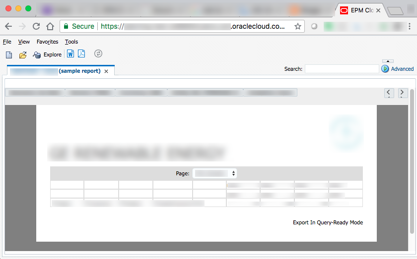
While working with PBCS and creating FR (Financial Reports) using the Oracle Financial Reporting Web Studio, I wanted to be able to send a simple URL to Users via email and at the same time use this URL in the Task List.

This would give them the ability to view on their mobile phone, tablet or browser directly without having to log into the app, search-dig around for the report via Reports, etc. They could simply use the URL or the Task List item!

Like this:


So, this is how you would do that, easily, and with a few simple steps.
These steps assume that you have already created and saved your Financial Report (FR)


Let's use the sample app = "Vision" in this case
and the folder "Plan Reports"
with the report named "Income Statement - Act vs Plan"


Step 1: Locate your report in the Web Studio repository folder; Done

example: Vision/Plan Reports/Income Statement - Act vs Plan


Step 2: It is Free to use, go to link https://www.urlencoder.org/

2.1) In the box where it says "Type (or paste) here..."
follow those instructions ;)

2.2) click > ENCODE <

you then have a simply encoded the URL in the proper format

2.3) Copy the entire string result now encoded

In this example: Vision/Plan%20Reports/Income%20Statement%20-%20Act%20vs%20Plan

notice that I needed to also encode the folder "Income Statement" since there is a space in the name


Step 3:
It is fun to know that Workspace is still running, makes me feel like I should be looking for the ships-wheel, Ahoy Matey! .. but I digress ..


The reason that I mention Workspace is because it is needed for this next step.
Your desired outcome should look like this example.
https://<your_services>.oraclecloud.com/workspace/index.jsp?module=tools.relatedcontent&repository_path=/<folder_name>/<encoded_report_name>
Now let's break up the parts


Part 1: <your services>
example: planning-test-MyCompany.pbcs.em2

Part 2: .oraclecloud.com/workspace/index.jsp?module=tools.relatedcontent&repository_path=/

Part 3: <folder_name>/
part 3a: if needed, add folder names
example: Vision/Plan%20Reports/

Part 4: <encoded_report_name>
example: Income%20Statement%20-%20Act%20vs%20Plan

This is an example of the final result:

https://planning-test-MyCompany.pbcs.em2.oraclecloud.com/workspace/index.jsp?module=tools.relatedcontent&repository_path=/Vision/Plan%20Reports/Income%20Statement%20-%20Act%20vs%20Plan

You can now copy paste that URL and use it in the Task List or simply email that URL to any user that has the proper provisioning to run the report!


Sunday, April 29, 2018

Spring Fever .. OAC .. Major League Baseball

It is that time of year again --

when spring is upon us
the snow starts to melt
the birds chirp outside the window in the morning .. 
and the Major League Baseball season begins ⚾

As I am getting ready for presentations, I wanted to share a few neat visualizations .. a little bit of a sneak peak.

CAN'T WAIT for anyone who wants to attend to see the full finished product!


Custom Plugin CollapsibleTree

WITH DATA (#measure)


WITHOUT DATA (#measure)


This is still one of my favorite visualizations!

DimPlayer is my favorite combo visualization!


And now that the 2018 MLB season is underway, it is time to update the ALL_MLB_STATS Essbase cube with 2017 data :)


A nice night & weekend little project is about to get started!! Stay tuned


Thursday, February 15, 2018

OAC - Essbase .. WRITEBACK via OAC - DV!!

OAC - Essbase WRITEBACK IS ALIVE!


Well, the day has finally arrived, Essbase Writeback in the cloud is real .. and a thing 😎🤓🤓😎


Let's get into the how-to and what it looks like.


But first, a BIG shout out to Gary Crisci for being able to battle the patch frontier and slay the OAC demons!


OAC - Essbase patched to version 109 .. skipped right over 108 to specifically Version 12.2.1.1.109 - Build 126


Steps to success


  • Create an Essbase cube in OAC (thought that this step and a few others might be obvious ..)


https://www.oracle.com/solutions/business-analytics/data-visualization/library.html


  • Find the Custom Plug-In: Essbase Write-Back plugin by Oracle


  • Click Download to Download the zip file


  • Log into the OAC - DV/BI instance


  • Go to Console


  • On the panel, click Custom Plugins


  • Upload the saved Custom Plugin from the step above, drag and drop or click "Upload Custom Plugin" and select the zip file


  • On the panel, click Safe Domains


  • Click, "add domain"


  • Domain Name: enter * (wildcard)
  • Check all of the boxes: Image, Frame, Script, Font, Media, Connect


  • Sign Out of OAC DV/BI
  • Sign back into OAC DV/BI
  • Navigate to Data Sources / Create / Connection / Oracle Essbase (Beta)
>>> When does this Connection Type not say (Beta)! <<<


Connection Details:

*New Connection Name: "Your Essbase Server"

*DSN: IP or host:Port /essbase /agent
ex. http://my.IP.address:80/essbase/agent

*Username: <AdminUsername>

*Password: <AdminPassword>

*Authentication: Always use this credentials??

  • Click 'Save'


From the OAC - DV/BI Home

  • Click Create .. Data Set ..
  • Select the Newly created Connection
  • Select the Essbase Cube that is a part of that Connection that you want
  • Click 'Add'


You should see a notification "The Data Set was successfully saved."


  • Now go ahead and create a Project
  • Select the cube you added as a Data Source of the "Essbase Server" above
  • Create your visualization adding the dimensions .. ALL of the dimensions
  • Change the Visualization..


  • Select the "Essbase Writeback" Viz


Now your Viz looks more like a reporting grid 😀 .. go ahead and double click a data cell .. and enter/change data .. Click 'Submit'


In this case I changed Sample Basic
Budget Sales May 400-10 Wisconsin from 90 to 100


Nice to see the cell change color to the muted yellow similar to either Workspace or Smart View

You should now get an inline popup window that is asking to re-validate the credentials in order to accept the data change being submitted to the cube..


Target Database Detail:
Should all be the same credentials that were used above
ex. http://my.IP.address:80/essbase/agent
*Username: <AdminUsername>
*Password: <AdminPassword>

  • Click 'Fetch'
  • Click the dropdown arrow for Application and make your selection
  • Click the dropdown arrow for Database and make your selection
  • Click 'OK'

.. and your grid should "Refresh" .. wait for it

and now be updated with the new data value(s) saved in the cube!!!!


Coming soon .. a blog post about the latest version of

Cube Designer Version 12.2.1.1.109 Build 126


Sunday, December 10, 2017

Smart View Release 11.1.2.5.720 & More

Happy to see another version of the Smart View for Office Add-in release! 11.1.2.5.720

You can go and download the patch set update PSU 26783864 here

And the Readme as well.

Documentation: Oracle Smart View for Office Documentation Release 11.1.2.5.720

There are a number of New Features added in this release, very exciting!

Take a look at the list:


Based on the first update, and specifically about Smart Query, I am going to have to go back to the post that I have had pending as a draft for a long long time ..

But at the moment, what does this update look like?


This give you a better way to manage all queries, modify, rename, run, etc.


Cascade Members from Multiple Dimensions

When selecting multiple members for a single dimension in the POV, now when you decide to cascade the report, a new dialog box appears kindly asking not only about the 'multi-members' but also the additional dimensions!! :)

I would be careful with this option,
you can see from the info stat that the number of sheets going to be cascaded for this is 3


This slight modification is going to cascade 36!!


After I clicked okay, my Windows machine was going haywire to say the least. There was flashing, cursor jitter, scroll bar shaking, the Excel window was '(Not Responding)' and turned black. There is good news. The queries all finally finished running and the workbook updated all 36 new query sheets and added them to the workbook.


HsGetValue Accepts Additional Data Types

This was something that as I was using the Cube Designer found interesting. I could create the Smart Lists from the wizard/workbook, create and load them into the cube, but not be able to easily validate that the lists looked as desired.

[HsGetValue] - {syntax to be updated here}


New Essbase Option for Preserving Comments and Unknown Members


Unknown members and comments for OAC users.
Also note that this option is found in the Smart View / Options / Member Options tab (Not the Data Options tab)


Extension Update Process has been streamlined!!

Now when you go into Smart View / Options / Extensions a new dialog box
appears when you click the hyperlink "⚠️  Check for Updates, New Installs, and Uninstalls"


This is great! Now that I have established a connection I can use that or any other connections/locations to find updates. Select and click 'Get Updates'


In real time you will see the job running the check for updates, etc. the location used to check.
Once complete, you can close the window and see in the Extension list if there is indeed an update available.


Like these Smart View Extension 11.1.2.5.720 updates:

Oracle Journals


OracleBI EE!


Smart Query


Detailed blog posts to follow!

Since it has been snowing now for a few days here where I live,
I think it is appropriate to say officially that #WinterIsHere!